Grove

Grove enables teams to deliver a multi-chain user experience at scale.

An effort to be the leading open source player in the web3 ecosystem to deliver a cutting-edge multi-chain experience with a web application platform.

An effort to be the leading open source player in the web3 ecosystem to deliver a cutting-edge multi-chain experience with a web application platform.

Role

Senior UX Designer

Sectors

Technology, Web3

Disciplines

UX Design, UX Research, UI Design

Industries

Teams

Product, Engineering, Business

Date

Time Frame

2022-2024

Context

Grove's mission is to provide access to decentralized infrastructure for all web3 developers. Together with the Pocket Network, Grove serves 1b+ relays with low latency and constant activity time every day.

In essence, Grove is an RPC service (remote procedure call) that allows users to read and write data in more than 40 blockchains. Grove is built at the top of Pocket Network, a global decentralized nodes. Through the portal, Grove provides a layer of performance that improves the reliability and scalability of the pocket, while guaranteeing that high quality services users demand.

I joined the team in late 2022, before the company renamed Grove; At first I had to navigate between a restructuring of engineering equipment and products, with a little uncertainty about the future of Pokt Inc. and its business models.

Finally, for the first quarter of 2023, the new redesign strategy of the application, in line with strategic commercial decisions, formed a small equipment and ingenuity but with great agility, which allowed us to completely redesign the application, after speaking With users, allies, potential customers and investors.

[Image: Conceptual image (generated by artificial intelligence), of the vision of a new brand direction for the company, inspired by solar futurism punk. Credit: WE3]

Challenges

  • Understand the web3 infrastructure ecosystem, its main players, technology, business models and value propositions.

  • Understand Pokt Inc.'s (now Grove) value propositions at the technological, product and service level for its main users and stakeholders.

  • Interview dApp developers who use Pokt and those who have not used it, to identify pain points, friction in flows and gains.

  • Review the state of the application design to understand what improvements and opportunities can be made in the design system and the UX in general.

Users

User Group 1 - Established dApps

Developers who are part of a startup or creating their own web3 dapps and have used the Portal app's services.

User Group 2 - New dApps

Developers who are part of a startup or creating their own web3 dapps and have never used the Portal app's services.

User Group 3 - Product or Engineering Leaders

Responsible for connecting, maintaining, and improving their applications through the Portal app.

Design

Activities that I carried out in different instances, within the Design Thinking model.

These activities may not be strictly linked to each other, I show them as an example. Remember that the design process is not linear, it has a parallel and iterative character. Designers can immerse themselves in different phases depending on the situation.

Empathize

Discovery - Understanding the web3 infrastructure ecosystem

My first task within the organization was to understand how the portal application worked, how the POKT protocol worked, its blockchain, as well as the connection with other decentralized networks, in order to offer the platform's services.

Basically, the application aims to allow developers to create and manage decentralized applications, accessing endpoints of more than 50 different blockchains, where they can configure security, monitor data traffic, and even add collaborators to their team.

The first layer of operation is the POKT Network, an open-source decentralized network that supports the infrastructure. The second layer is the API developed by the Grove team (Prev. POKT Inc.) and finally, the application layer, which is a dashboard to visualize the API and provide data and metrics to users.

Competitor analysis for website and app redesign

Before designing, it was important to do this immersion. For the analysis, we focused on the websites or landing pages of direct and indirect competitors as well as similar applications in the ecosystem.

On a collaborative board, we placed screenshots of each competitor and identified positive, neutral and negative aspects based on heuristic principles of usability. We also created labels with post-its and color codes to analyze the sections, interface elements and content.

Once the analysis was completed, I created affinity maps to group the themes, count and rate each label based on the criteria we defined. By systematizing the information in tables or graphs, it allowed us to see both the competitors with the best practices in each theme, as well as the words that were most used in the ecosystem to communicate value propositions, use cases and tools to users.

Finally, I shared with the business, marketing, development and product teams the most important findings along with UX recommendations to consider for the redesign of both products, which was very well received by the leaders of each vertical.

[Image 1: Analysis of the 3 main layers that support the Pokt Portal App]
[Image 2: Board of the benchmark including screenshots of the competitors with notes and labels for the analysis]
[Image 3: Table with the comparative analysis of the information architecture and ux principles, with insights and recommendations for the ux design]
[Image 4: Tables with comparative analysis of product and services and a word cloud chart]

Current state of products from an interface and experience perspective

At this stage it was also crucial to analyze the current state of the website and the Portal application. I did this again, on a collaborative board, so that the teams could access and contribute.

In both cases, we detected experience and interface improvements, from content, information architecture to component and navigation inconsistencies.

[Image 1: UX Analysis of the pokt website, early 2023]
[Image 2: UX Analysis of the Portal App, early 2023]

User research: planning, recruitment and selection

Despite already having enough information about possible improvements in both products at the design level, the product team pushed for a test with users.

For planning, I created a research canvas to pour out all the research hypotheses, objectives, scopes and methodologies and to obtain feedback from the team.

For recruitment, I used a database of contacts from public events where Grove had been presented to users without context of the application, and on the other hand a database of active users on the portal.

For profile selection, I created a survey in typeform.

[Image 1 and 2: UX Research board, based in different references.]
[Image 3: Survey board with participants' responses made in typeform.]

Generative User Research - Planning, Execution and Analysis

We recruited and selected 5 users, of which:

- All participants were male between 30 and 40 years.

- They live in different continents; America, Europe and Africa.

- All were developers.

All interviews were in-depth, with questions focused on the daily life and behavior of users (context), their relationship with web3 infrastructure services, set of technologies, current projects, security and payment methods.

The approximate duration of each interview was 40 minutes. I recorded each session for later analysis.

Evaluative User Research - Usability Testing

Once the interview was over, we proceeded to the usability testing, where I presented each participant with a scenario and then a task. I asked them to think out loud and share their screens.

For each task, I measured effectiveness (conversion) and efficiency (time on task) at each step along the way to achieving the goal.

I also made notes on any issues they had with the interface, measuring the incidence for each user.

[Image 1: User interview systematization board, divided into thematic stages. On the left, the typeform responses, for reference.]
[Image 2: Screens of the usability test flow and a frame from a test with a user.]
[Image 3: Usability test analysis and systematization board, by tasks, subtasks, effectiveness and efficiency.]

Key findings

🎤 Insight: Developers come from different backgrounds, but are generally full stack. They may still be working on web2, but are actively developing on web3.


💡Opportunity: Target leading developers and web2 profiles to bring them into web3 development.

🎤 Insight: They know the main infrastructure providers, their pros and cons. They value good and reliable service even if their projects are still small.


💡Opportunity: Continue to focus on providing the best possible service. Endpoints are no longer a value proposition, but a minimum. Expanding the portal's features and capabilities is crucial.

🎤 Insight: Developers value pokt for decentralization, multichain and integration, but they don’t use
the portal as much as we could imagine.


💡Opportunity: Keep mentioning in the marketing the value props of being a decentralized player.
Make comparable tables, show the advantages of multi-chain, dev implementation and costs.

Usability


- The average conversion was 4.5 tasks out of a total of 6 (75%).

- Only 2 out of 5 users were able to complete the task.

- 80% of the interface issues were major

- Of the 2 users who completed the tasks, the average time was over 45 seconds, which can be improved.

Define

After obtaining a wealth of learnings from the immersion, discovery and research stage, we focused on working on the definition in the product and development team; we took the ideas for improvement and turned them into requirements that could be worked on incrementally during the year.

On the one hand, we worked on improvements to the API, which did not depend entirely on being developed in the application layer and on the other hand, we deployed improvements to the interface and the experience that could give us feedback from users while a new redesign could be carried out.

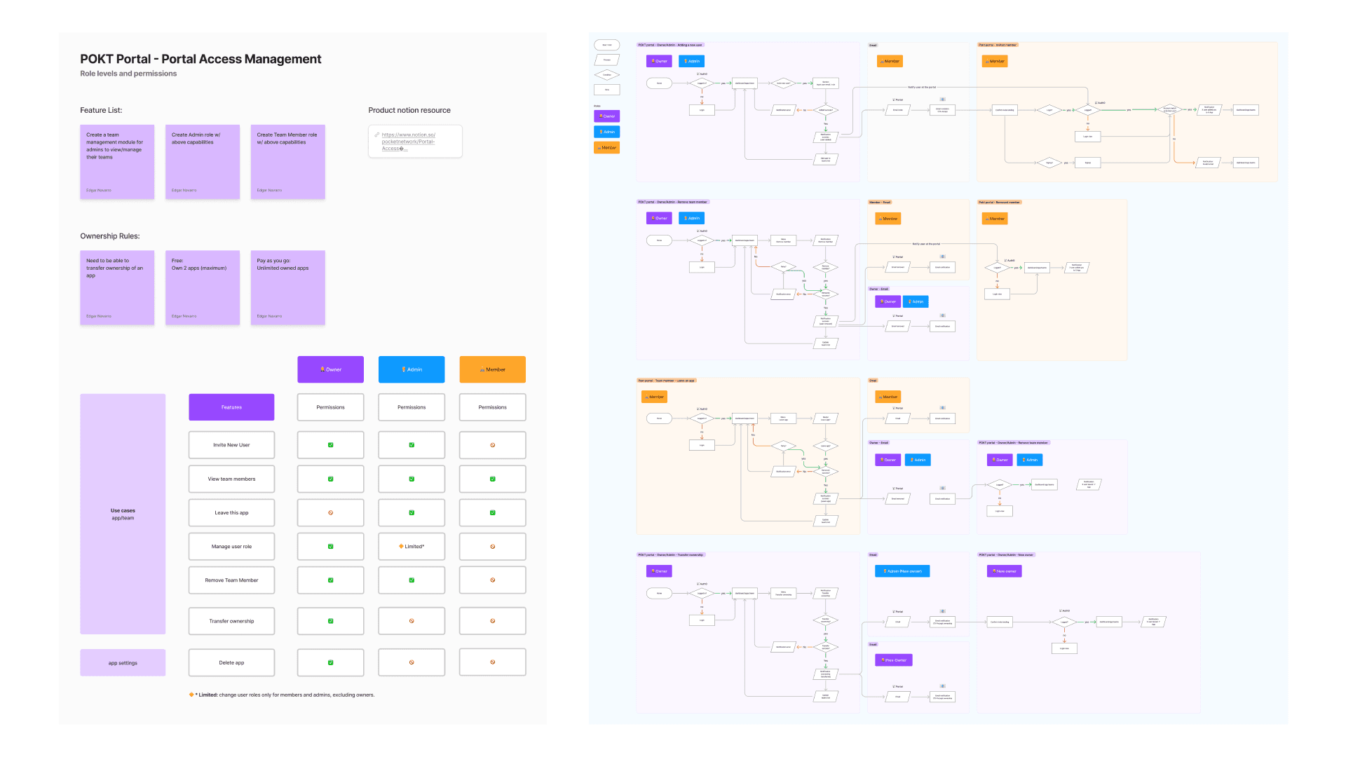
Such was the case of the implementation of the team management feature, which was launched with the internal interface and in which an owner of a space with multiple applications could invite members of his team to collaborate.

[Image: List of features, roles by user type, and workflows for the Teams feature in the portal (portal access management).]

Ideate

Working against the flow, adapting to uncertainty

As we sought to create a workflow in which we could introduce more new feature designs to the app, a bigger challenge arose: the company restructured, teams were suddenly downsized, and we ended up with a reduction in development, product, and design, where from 5 people, I was left alone.

In this period, while the leaders sought new investments, I was dedicated to creating concepts for the app redesign, as well as internal improvements such as refining libraries and design documents in figma.

[Image 1 and 2: Ideation of new interface design, components and functions for the portal application, prior to transition to Grove.]

Prototype & Test

New year, new team 😎

Luckily, by the end of the first quarter of 2023, the outlook improved and we were able to remake a new team; a small but agile product, design and development team, with the following profiles:

- 1 Product Owner

- 1 Product Manager

- 1 Development Leader

- 1 Full Stack developer, with a focus on Front End.

- 1 Senior UX/UI Designer

The chemistry in this re-formed team was unique and I dare say that it is one of the best teams I have ever worked in.

Let's get to work; let's build with what we have. 📐🌿

In parallel with the creation of this team, the initiative to redesign the Pokt Inc brand and the portal arose. The work would be led by the marketing team, hiring the independent design studio WE3.

From this new opportunity, we started working on conceptualizing and prototyping the redesign of the application, from an MVP perspective, taking the main features of the API and adding new functions and experiences for users.

We created wireframes of the 3 most important user paths of the app, keeping in mind a new, more efficient and scalable interface, without leaving aside the lessons learned from the previous stages.

[Image 1 and 2: Low-fidelity prototyping and ideation sessions for the redesign of the new Portal application for Grove.]


Visualizing the future

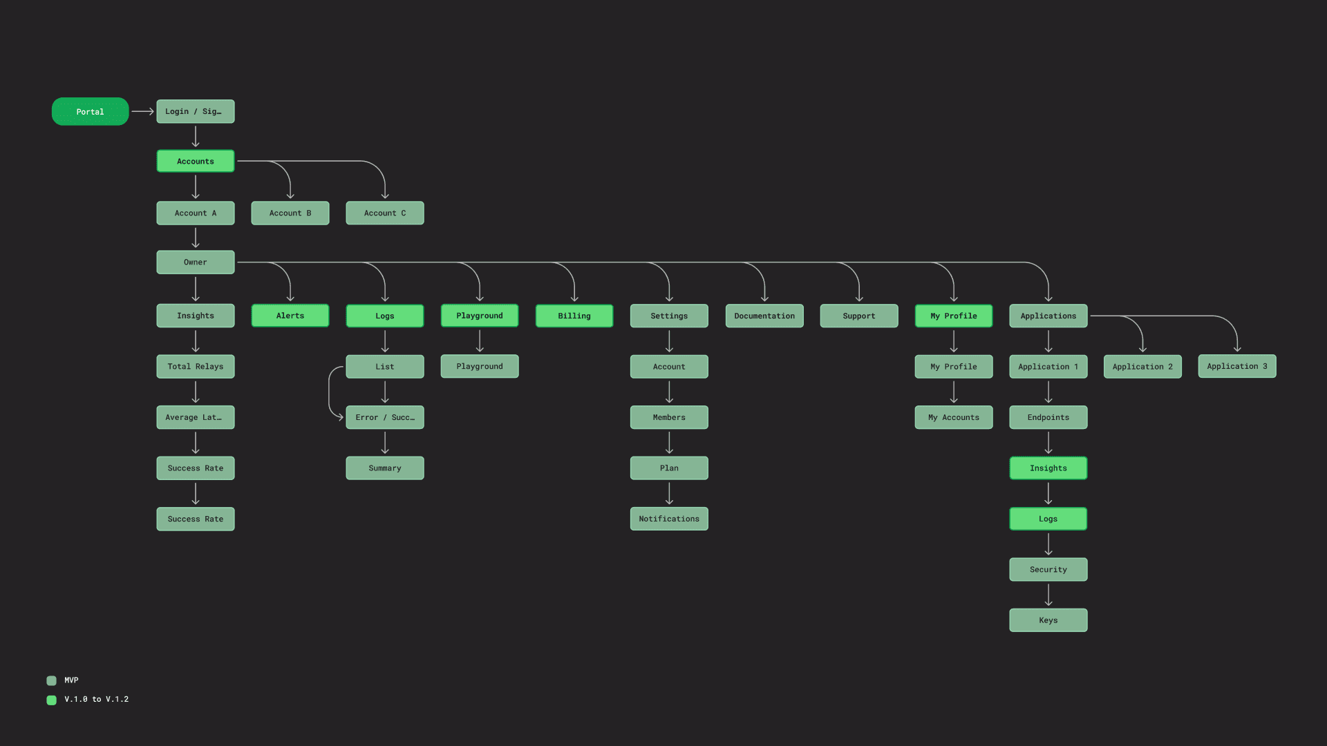
A key part was creating a consensus across all teams on what the features of the new Minimum Viable Product would be and what functions would be developed later.

In addition to considering the guidelines and needs of what the company's main clients asked us, we also measured the effort and impact of each feature, in this way we were able to draw up a more realistic design, product and development route, based on the team's capabilities.

[Image: Feature diagram for the new portal application, divided into the MVP phase and subsequent phases.]

Final Designs

New fresh brand

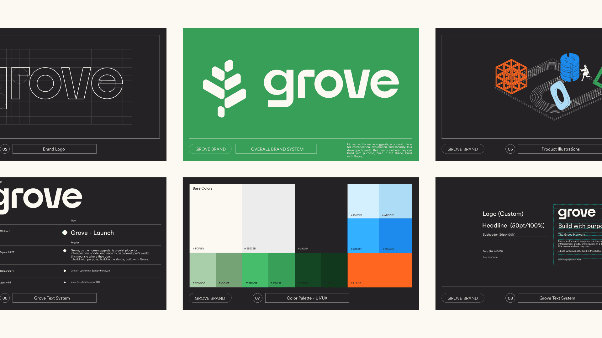
The rebranding was carried out by independent branding agency WE3. We collaborated by providing feedback on elements of the design system, brand architecture and initial website proposal.

[Image 1: Left: Original brand we use as POKT Inc. Right: The new Grove Inc. brand.]
[Image 2: Overview of the brand manual.]

New design system and interface.

The new brand "Grove" was ready and with it a new challenge to generate interest in our application that we had to redesign in record time: 1 month.

We took on the task of taking the most important aspects of the brand guide and adapting them to a totally new Design System.

We came to the consensus that the new interface system had to meet 3 main characteristics:

- Scalability

- Adaptability

- Efficiency

We reached a consensus to re-use an existing component library that was highly customizable, so we went with the mantine option.

Regarding the design of our system, we used a mantine figma library and adapted it while creating the new flows, screens and components. The result was excellent, since at the same time that we created responsive components, the handoff for our developer was intuitive and easy to implement with the dev mode in figma.

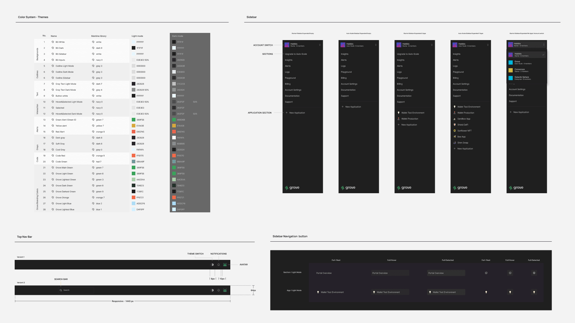
Additionally, mantine allowed us to quickly create a dark and light mode ready library by using the variables feature in figma as color token equivalents.

Visit grove.city to signup and experience the application live.

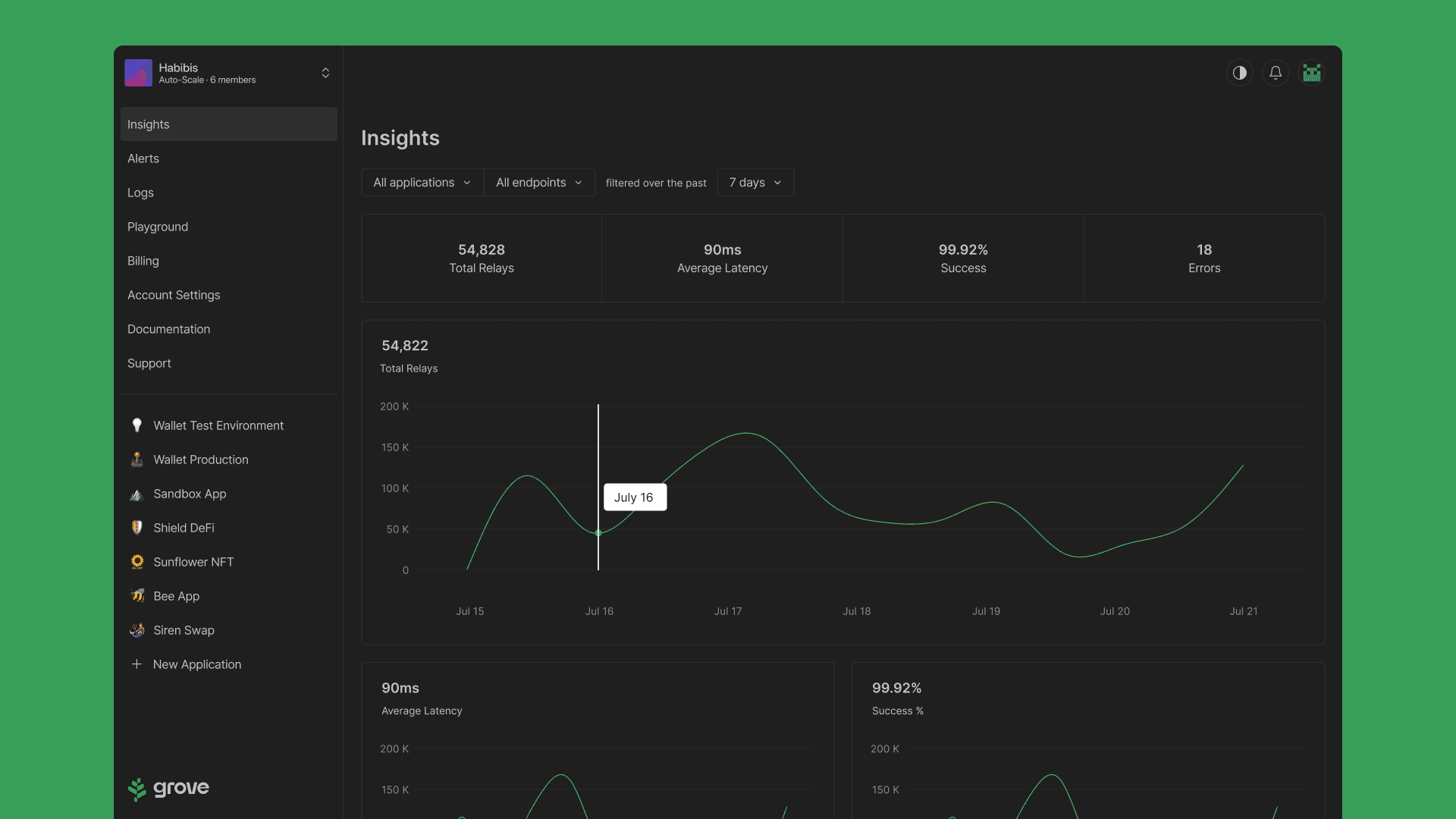
[Image 1: New interface for the app's main page, showing the Insights section.]
[Image 2: Component design examples. The color system shows the hex codes ready to be implemented in both themes (light and dark).]
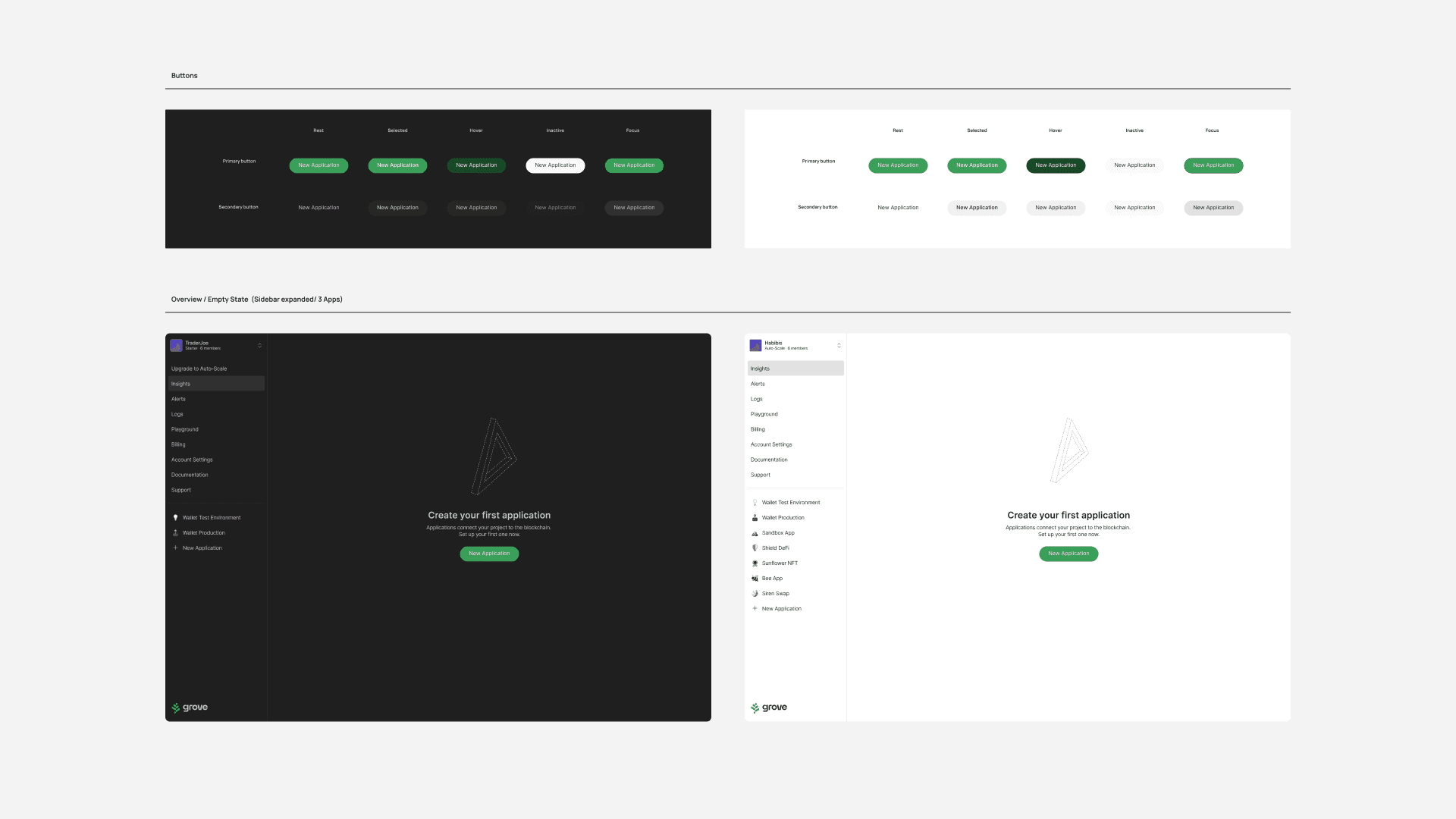
[Image 3: Button component with its variants and dashboard interface example, both in light and dark modes.]
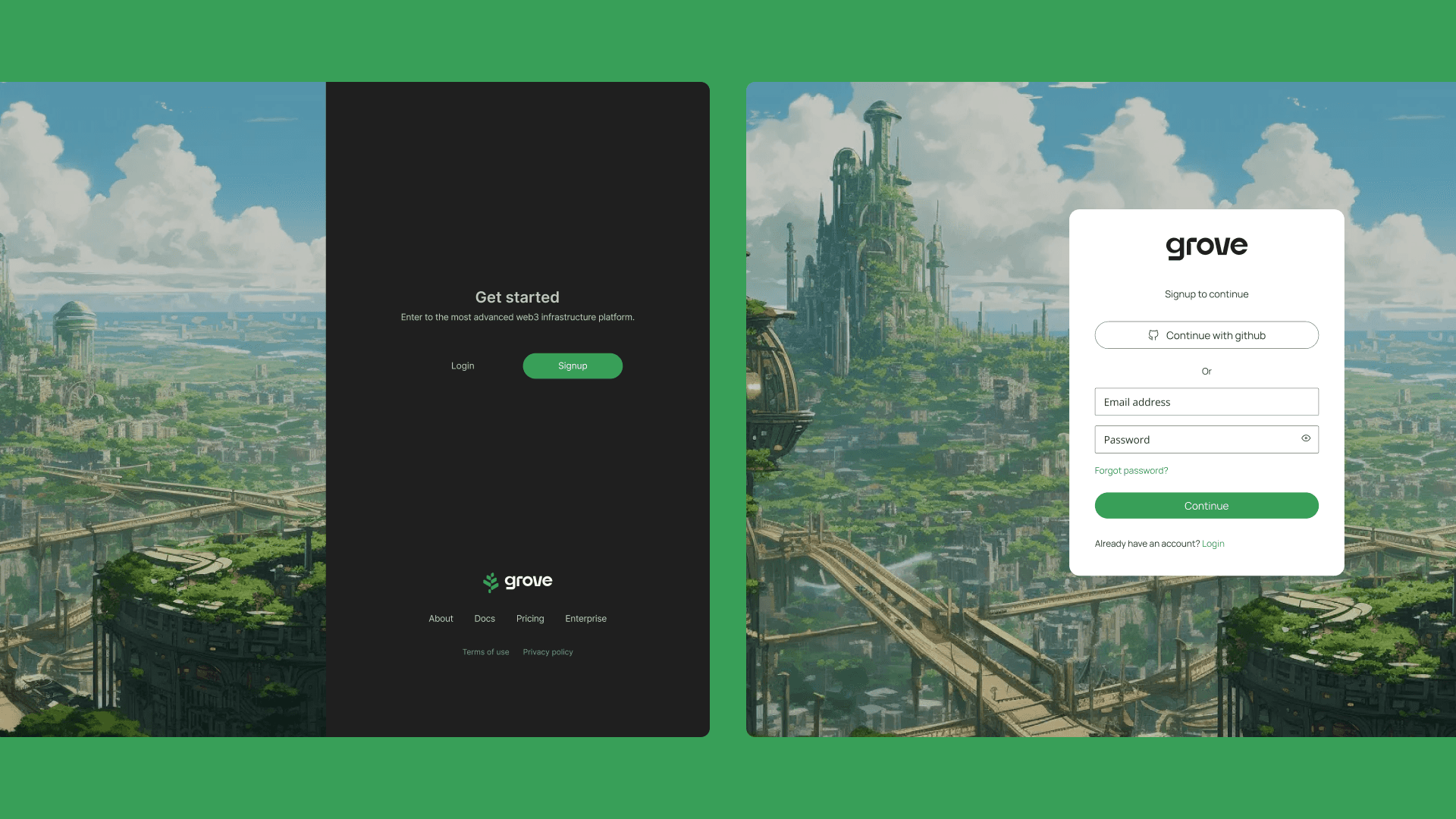
[Image 4: Login]
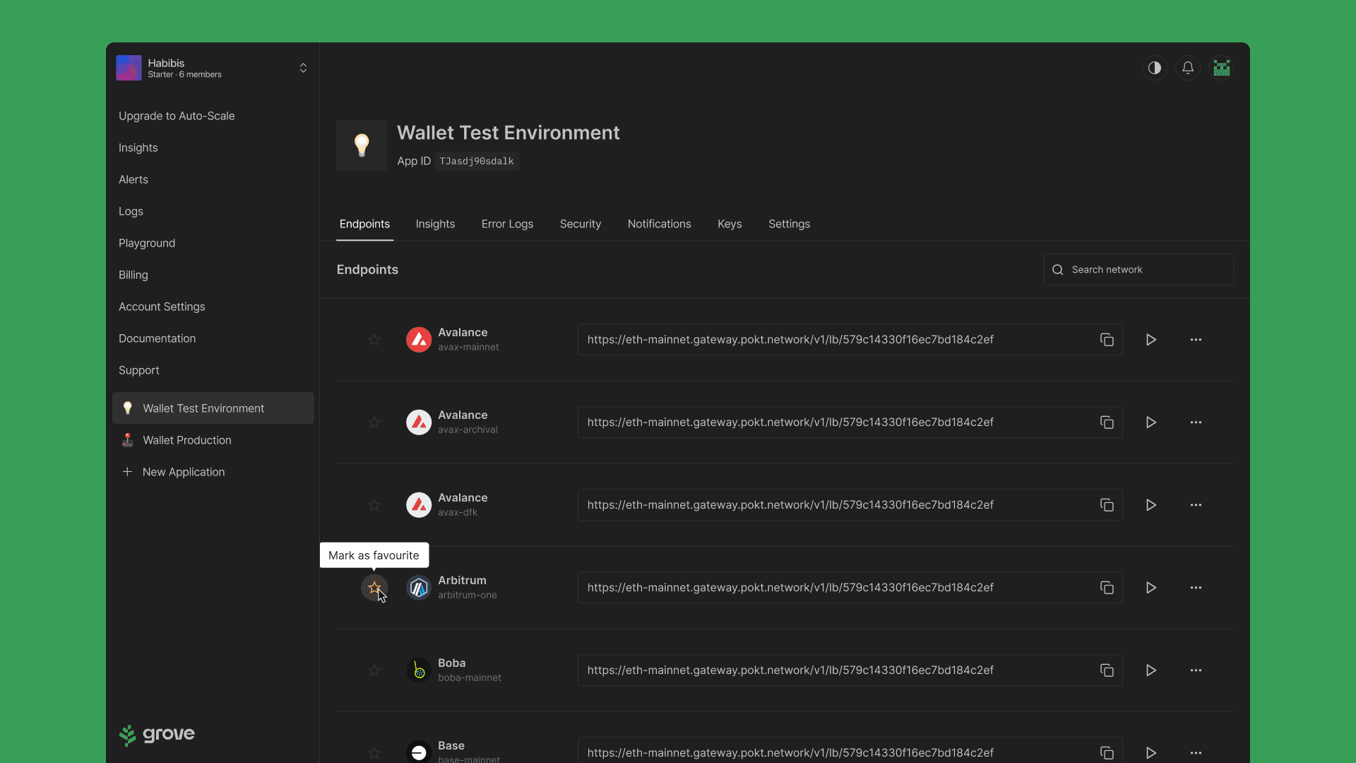
[Image 5: View of one of the applications, in the endpoints section, showing the interaction to add as a favorite to one of the networks.]
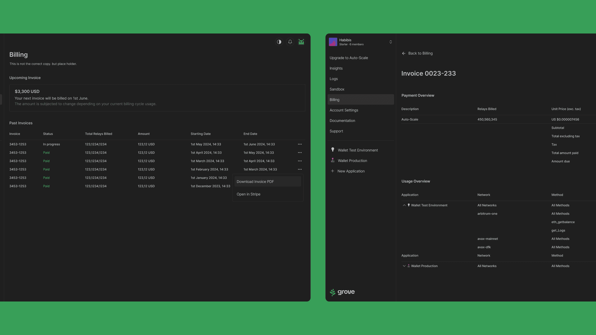
[Image 6: View of the billing section, along with invoice details.]
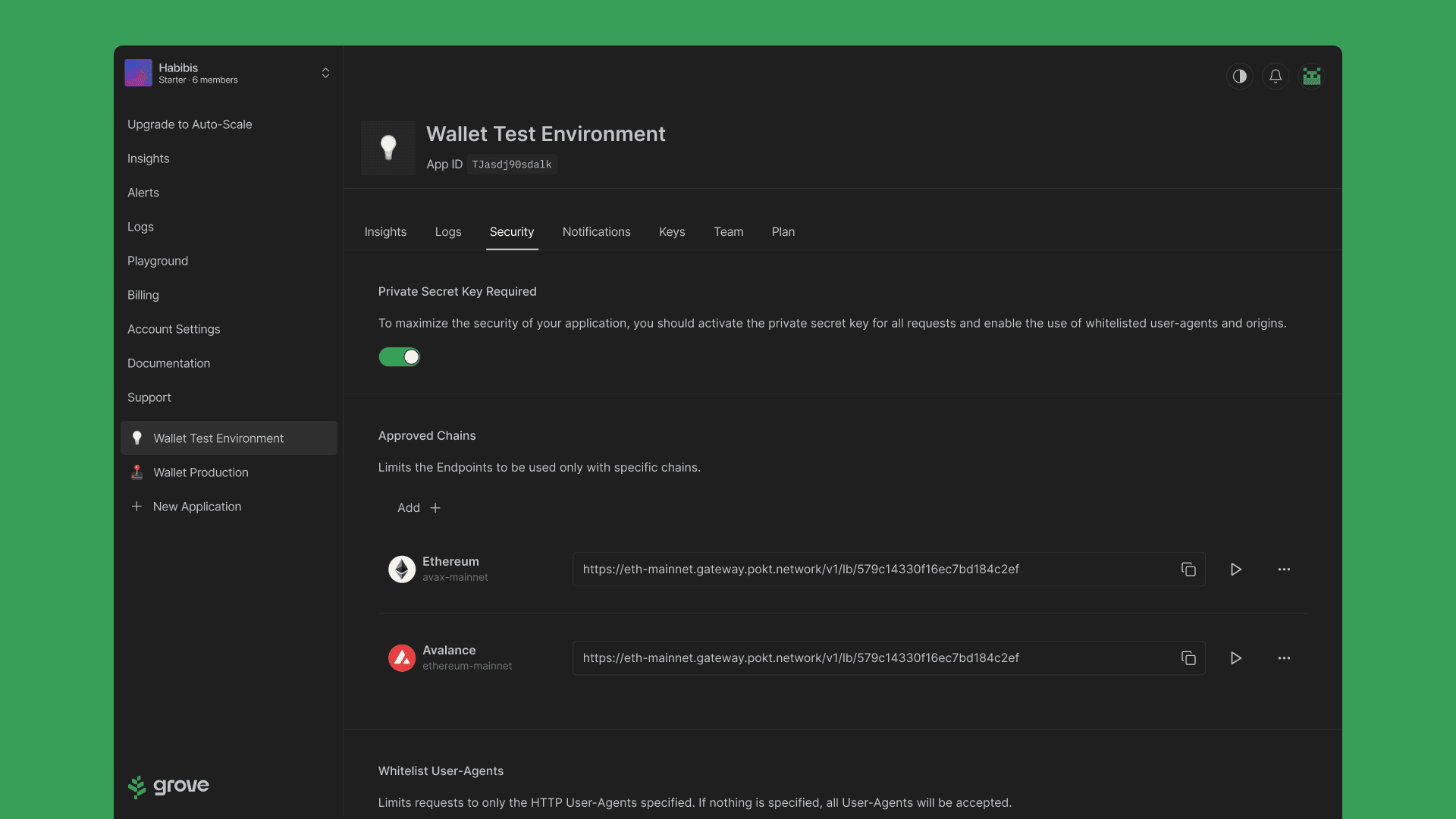
[Image 7: View of the Security section, with some of the configuration options.]

New features for a new era of the Grove App

With the implementation of the new interface, new challenges and ideas arose to progressively improve it.

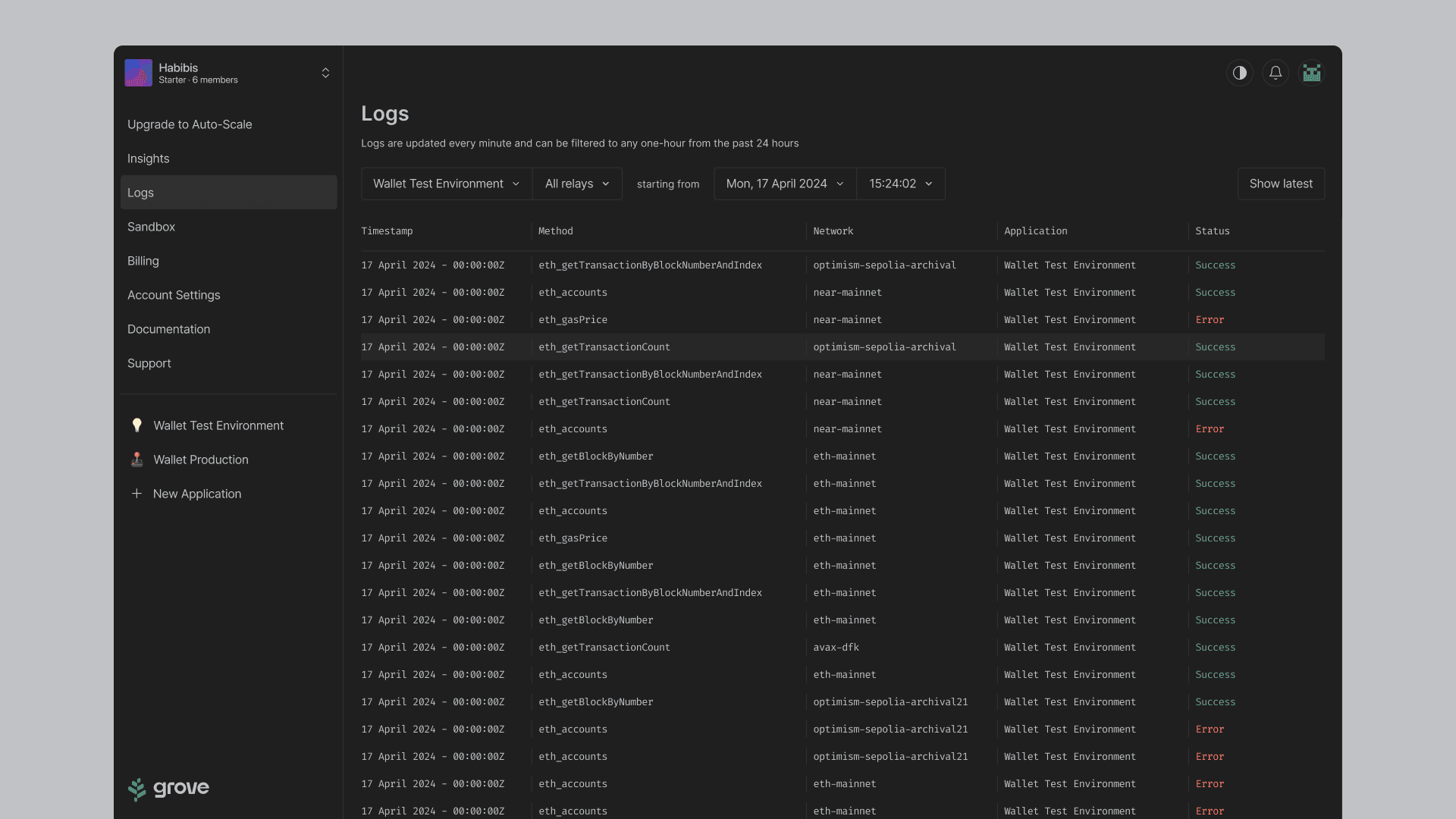
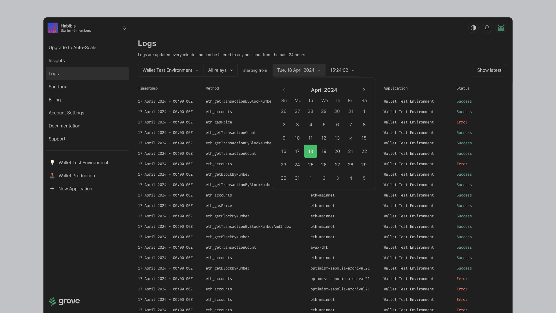
As an example, we developed a 'Logs Module', where the user could see in real time the relays (calls) by application, by type of call, by network, if they were successful or had errors.

We also enabled a system of filters for time stamps by hour, minute and second.

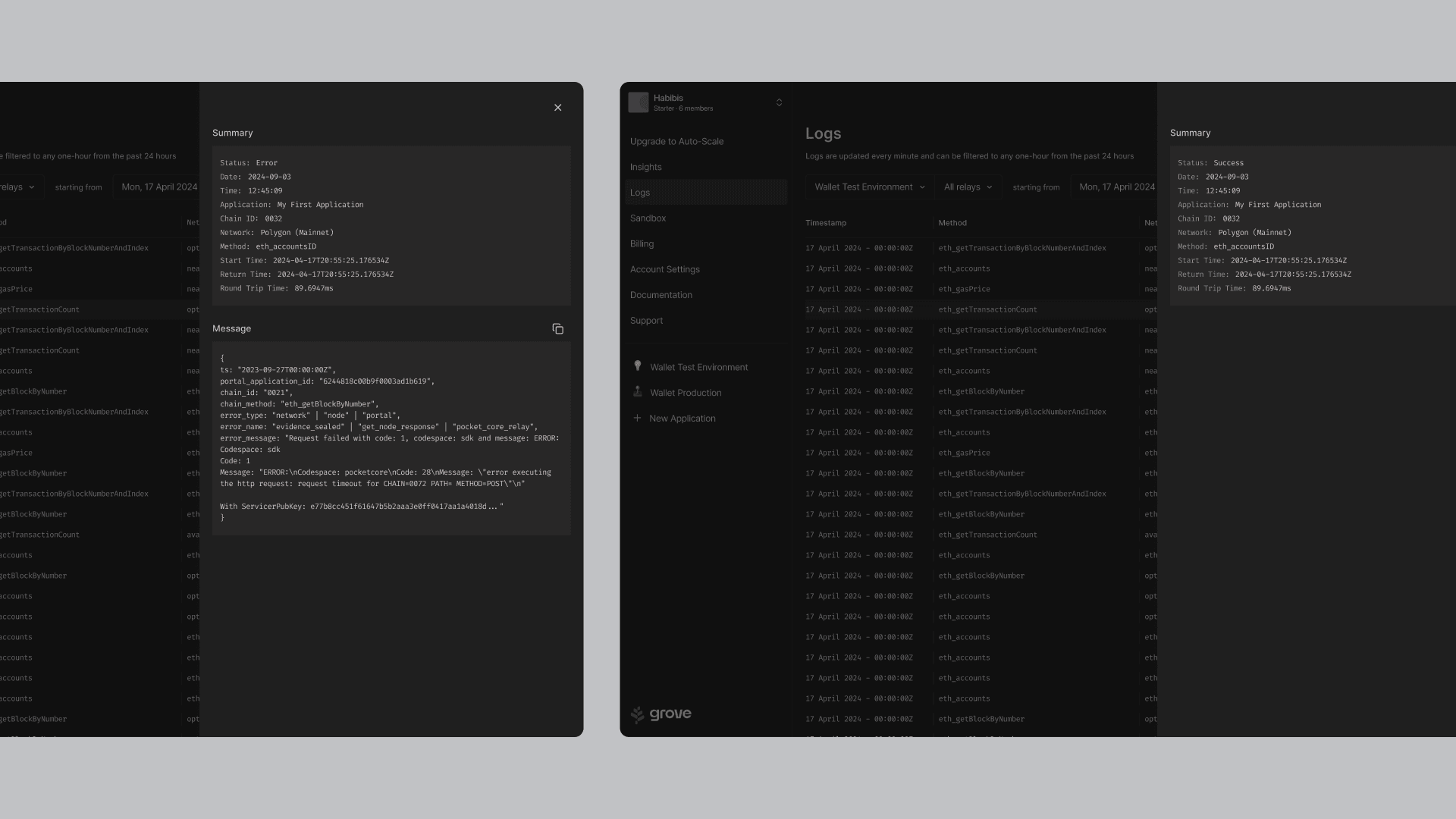
We also designed a detail panel, where they can view the API message in case of errors or the round trip, return and round trip times.

[Image 1: View of the logs section, showing the list and status of each of the calls.]
[Image 2: Side panel with details of the log previously selected by the user.]
[Image 3: Log filtering by date.]
[Image 4: Log filtering by time stamp.]

A new website for Grove

In parallel to our product work, we were tasked with creating the new grove website, since for various reasons, the platform on which it was originally developed would no longer be used.

Since marketing efforts and PR strategies were focused on important community events, we had only a couple of weeks to conceptualize and launch the site, with the necessary information to make ourselves known.

We achieved this by creating the site with webflow, with brand assets previously designed by the design agency and creating new sections practically from scratch.

We believe that the result was good despite the time pressure; we were then able to improve and refine some sections on which we received feedback.

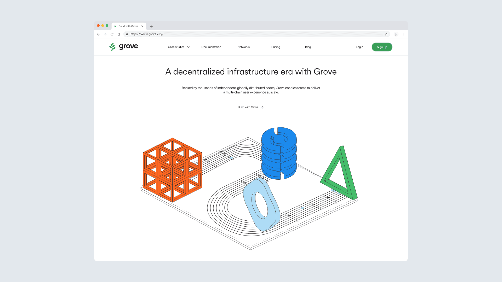
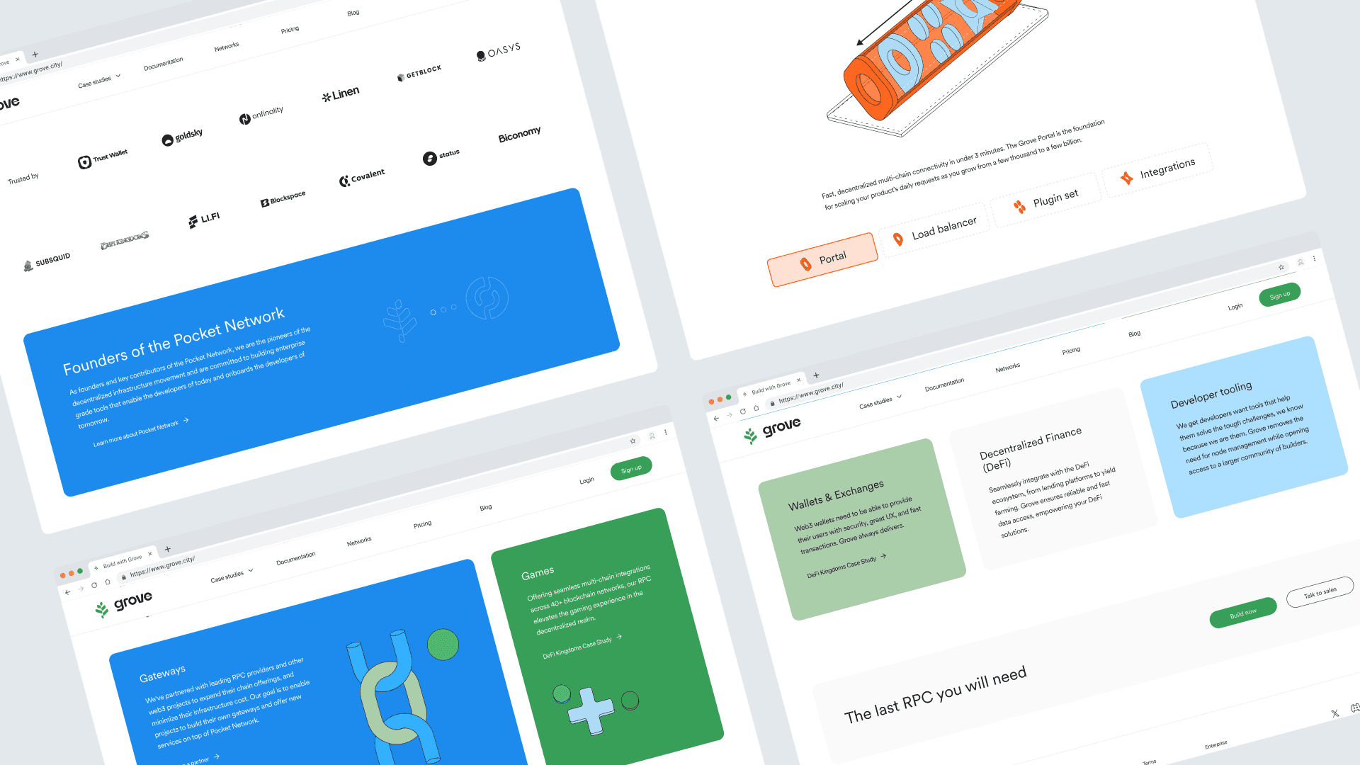
[Image 1 and 2: Preview of the homepage of grove.]

Pitch deck for investment rounds

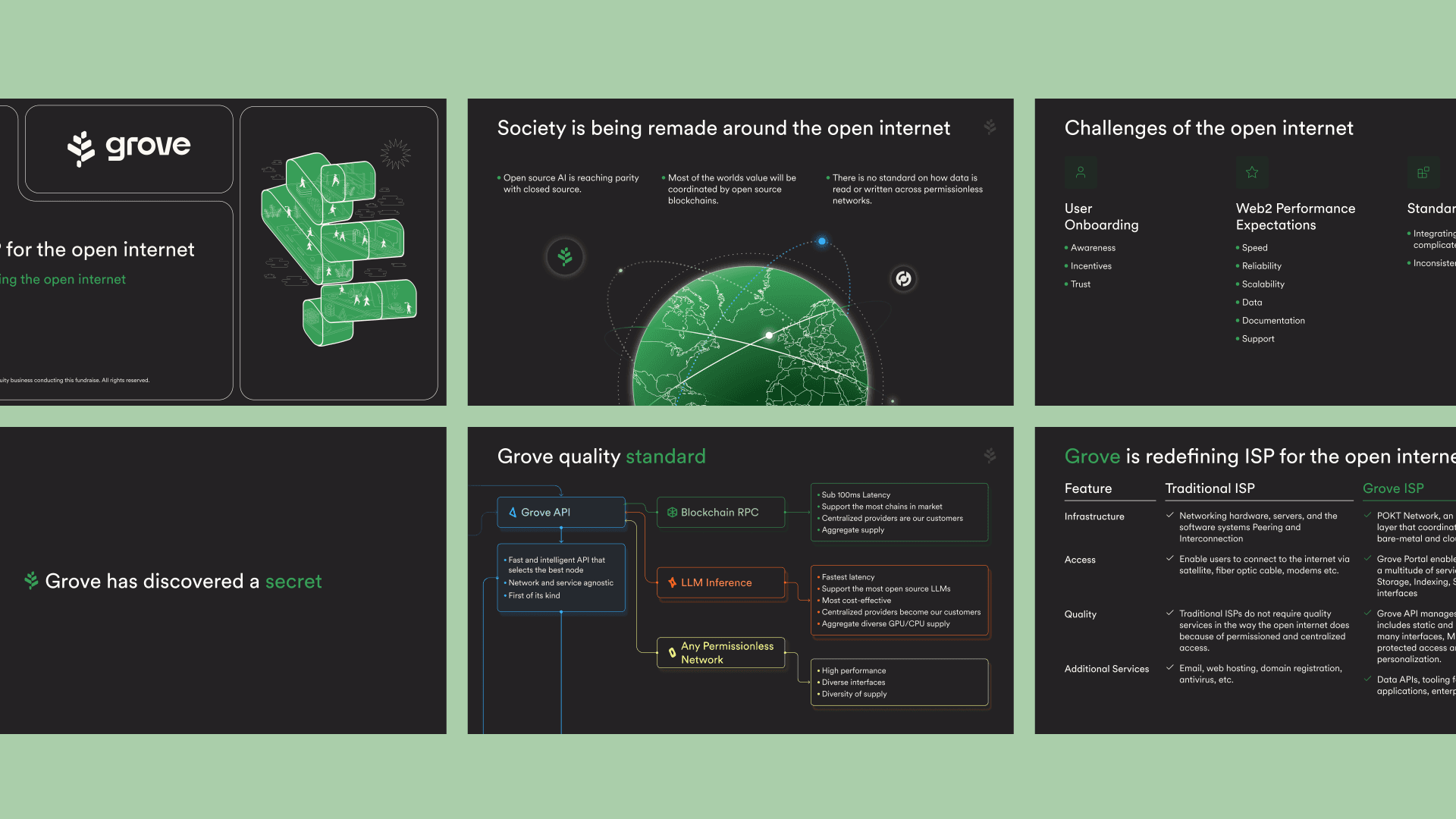
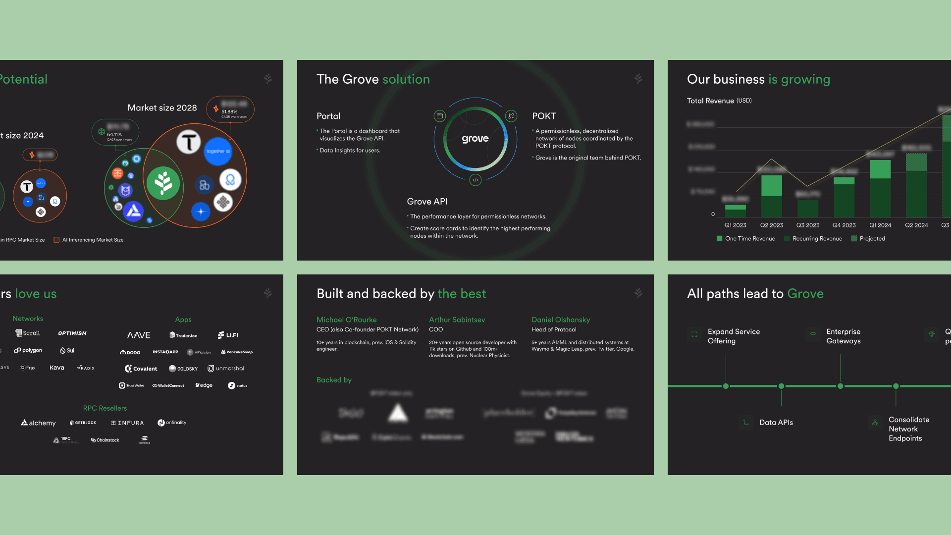
The company's leaders gave me the opportunity to also collaborate on what would be the first new deck for investors at Grove.

In a two-month work and 3 versions of the deck, with improvements based on feedback from leaders and external clients, the company managed to raise $8M USD in the fall of 2023.

[Image 1 and 2: Example of deck slides.]

Impact

  • Web App Design: End-to-end product redesign, including new features and usability improvements, to serve over 18,000 unique user accounts across multiple countries.

  • Design System: Creation of components with variables and variants ready to be coded. Management and updates in the figma library.

  • Website: Helped redesign the company's new site in 2 weeks in collaboration with Product and Engineering leaders.

  • Brand: Manage branding and marketing assets in figma libraries. Helped design the presentation and sales decks/books for two rounds of investments with $8M USD raised.

  • User Research Project: Interviews conducted with a generative research approach and usability tests to identify product improvements. I generated 25 new insights for the UX and UI.

Credits

Leadership

Michael O'Rourke
Co-Founder & CEO at Pokt Network

Arthur Sabintsev
Co-Founder & CEO at GroveCo

Product

Gabriela Rodriguez
Product Owner and Strategist

Zayne Matthysen
Product Manager

Development

Fred Teumer
Head of Engineering

Kevin Utoft
Engineering Leader, Architect and Developer

Rabee AbuBaker
Senior Full-stack Engineer

Pascal van Leeuwen
Backend Engineer

Ricardo Antonio Arias Rodríguez
Backend Engineer

Hebert Cuellar Lemus
Senior Software Engineer, Infra

UX / UI Design

Edgar Navarro
UX, UI, UXR Grove

Valeria Benitez Florez
UX Lead Pokt Inc.

Cecilia Velozo
UI Pokt Inc.

Sales

Richard Goodrum
Head of Sales

Brand Design

Cristian Monroy
Brand Designer

WE3

Let’s work together

I am always open to new opportunities and challenges.
Let's talk and see how we can collaborate.

Copyright © 2024 Edgar Navarro. Mexico.

Let’s work together

I am always open to new opportunities and challenges.
Let's talk and see how we can collaborate.

Copyright © 2024 Edgar Navarro. Mexico.

Let’s work together

I am always open to new opportunities and challenges.
Let's talk and see how we can collaborate.

Copyright © 2024 Edgar Navarro. Mexico.